Explore by category


Explore more
Explore by collection
 New
NewIntroducing our new
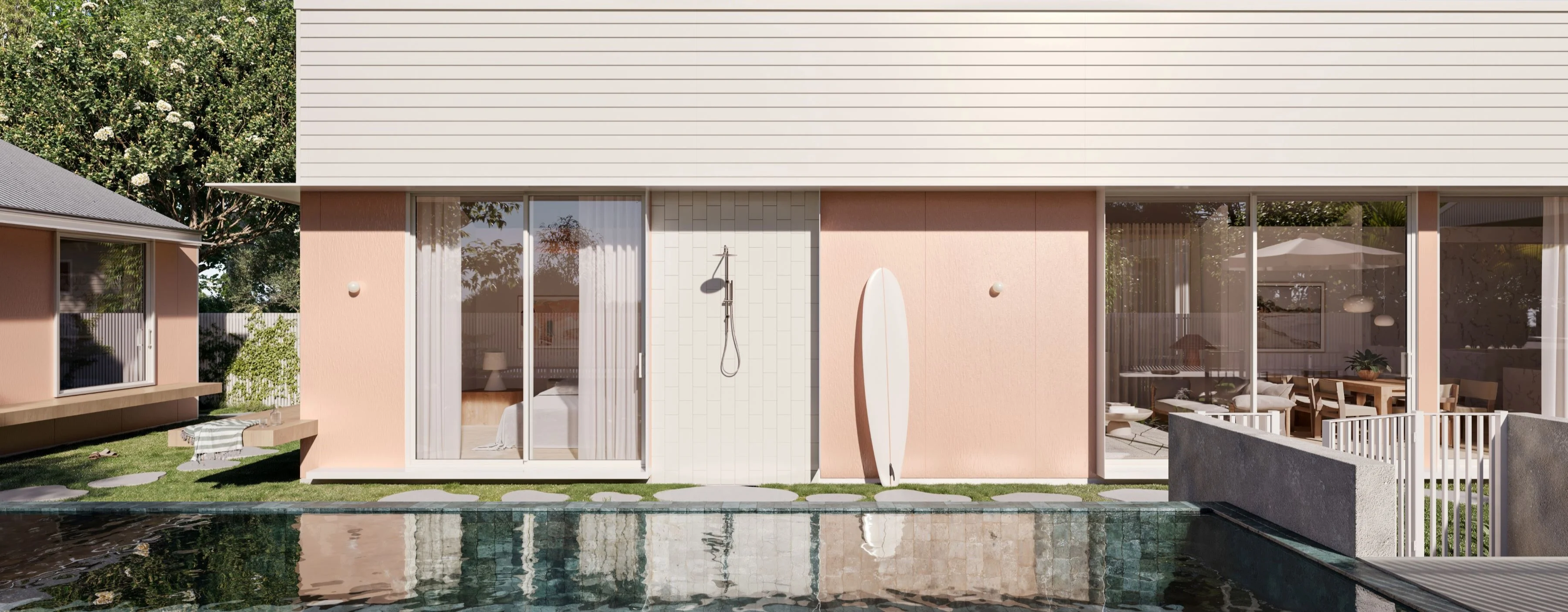
Hardie™ Gravis™ Panel
A lightweight concrete for external cladding, flooring and more.
Inspiration
Guides
Tools
Explore Home Styles
Modern Homes Forecast New
NewModern Homes Forecast 2026
Stay up to date with the latest trends in home designs


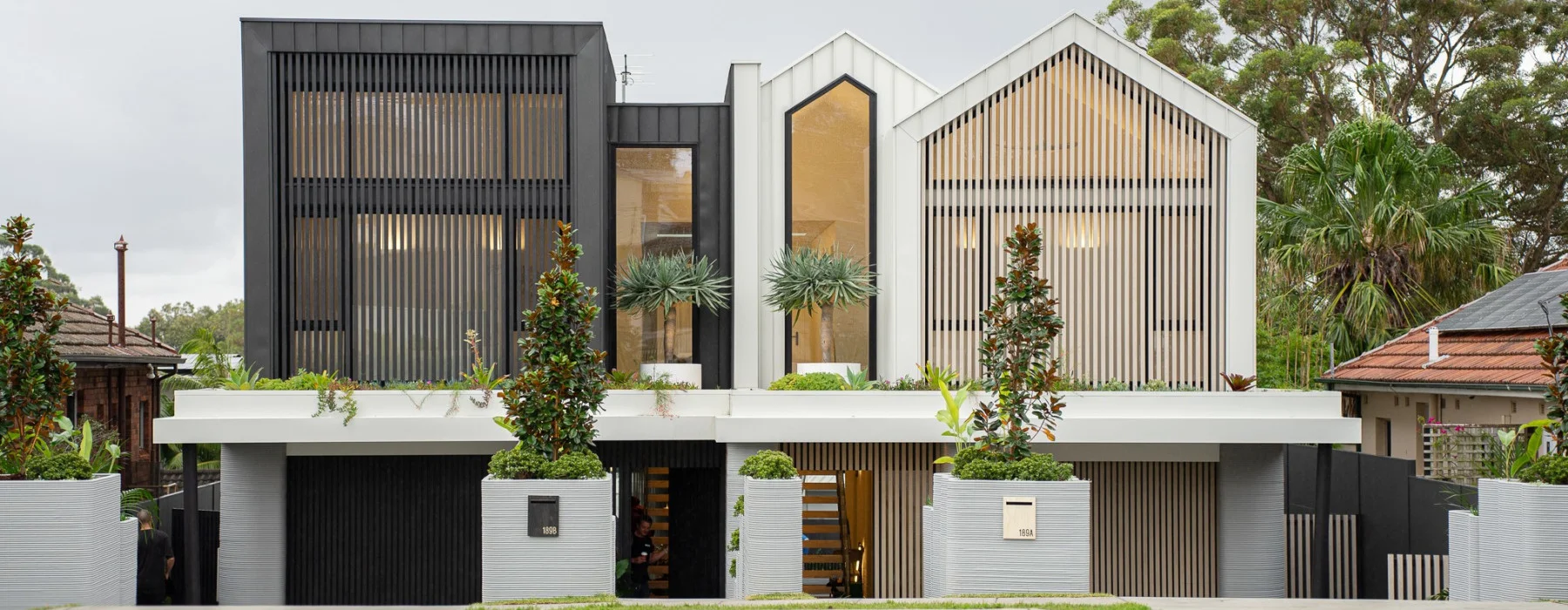
When a Brisbane builder and homeowner wanted to create a modern home that showcased a unique design, he chose a modernist look with a mixed materials façade to demonstrate an ‘anything is possible’ approach to custom built homes. The result is a one-of-a-kind design that makes a major statement.
A MULTIPURPOSE MAKEOVER
As an owner and builder, John Bicanic from Jux Developments has always desired a cubistic, modern home project to work on, which is why a mixed material exterior proved to be the perfect choice for this Queensland renovation. Taking cues from a traditional modern style – angular lines and monochrome palette – this design introduces a new element through use of textures in unexpected ways.
This bold, creative approach to façade renovation allows homeowners the freedom to show off their individual style and create a one-of-a-kind look that reflects their personality. By keeping colour and lines simple, textural materials take centre stage and create a high-end, custom-made feel, which was the aspiration for this home.
Modernist makeover of 1970s brick home A modernist makeover: Boxy shapes, multi-directional lines, and a monochrome colour palette give this renovated home some serious street appeal.
The project saw the transformation of a 1970s, two-storey brick building into a fabulous family home and office space. In addition to these design considerations, the team was running to a tight timeframe. “This was a major renovation using existing structures with a 100-day time constraint,” says John, who would live with his family in the home after completion. “We worked hard to meet all our deadlines, and made quick, informed decisions.”
FORM AND FUNCTION
Function is of foremost importance in modernist design, and hard-wearing, angular surfaces, and architectural features win out over fussier details when it comes to creating the streamlined exterior this style is known for. The result is a sleek and edgy home that stands out from the crowd while still remaining classic, fitting in seamlessly with its surrounds. “Key features of this look include a simple, clean, monochrome colour scheme,” says John. “This, along with the sharp angles, create a modern yet timeless style.”
For this eye-catching design, Scyon™️ Stria™️ and metal cladding products achieved the look John was aiming for. “The straight horizontal lines complement the vertical metal cladding and the render finish,” he says. Setting the tone for the rest of the home, the exterior features bold, linear lines that are hallmarks of modernist design and ensure a distinctive home starting from the streetscape. “The symmetry creates a refined look and adds to the simplicity and overall concept of the home,” he says.
Modernist home with Scyon walls Creating contrasts: “The horizontal line of Scyon Stria complement the vertical metal classing and the render finish.”
BOLD CONTRAST
Selecting two or three different finishes that contrast – here Scyon Stria cladding in light grey is juxtaposed with dark metal cladding – can immediately make a tired home look edgy and modern. Introducing natural timber, as John has done for the pool deck, brings warmth to an otherwise cool palette. Outdoor furniture and furnishings are an easy and affordable way to add a pop of bright colour, seen here in vibrant, red Acapulco chairs whose mid-century appeal is the perfect fit.
Modernist home with Scyon walls and pool Thinking outside the square: Natural textures like timber have been used to warm the cool contrast of Scyon Stria and metal cladding.
“I like the contrast of the linear Stria boards against both the dark colour and vertical lines of the metal cladding and the smooth finish of the rendered walls.” SANDY SMEDLEY
John and his team worked on the renovation alongside architect Sandy Smedley from Sandra A Smedley Building Design, who explains that each form was designed to contrast and layer, creating depth and interest through colour, horizontal and vertical lines, as well as height and level changes. “We opted for a monochromatic scheme to highlight the cubistic forms, using individual colours for each material chosen and linear elements to contrast the forms,” says Sandy.
The team chose a restrained colour palette to ensure the focus stayed firmly on texture. “I like the contrast of the linear Stria boards against both the dark colour and vertical lines of the metal cladding and the smooth finish of the rendered walls,” says Sandy. John notes that using Scyon cladding saved time on the project due to its easy delivery, simple installation and very little maintenance. “Another product would have put us over budget and changed the look completely, it achieved our desired outcome,” he says.