Explore by category


Explore more
Explore by collection
 New
NewIntroducing our new
Hardie™ Gravis™ Panel
A lightweight concrete for external cladding, flooring and more.
Inspiration
Guides
Tools
Explore Home Styles
Modern Homes Forecast New
NewModern Homes Forecast 2026
Stay up to date with the latest trends in home designs


THE HAMPTONS LOOK Are you looking to build or renovate a Hamptons home soon? Here, Natalee Bowen of Indah Island shares some of the key colour trends that will shape the Hamptons look in Australia in 2019.
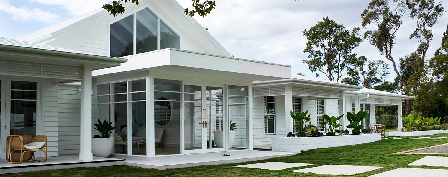
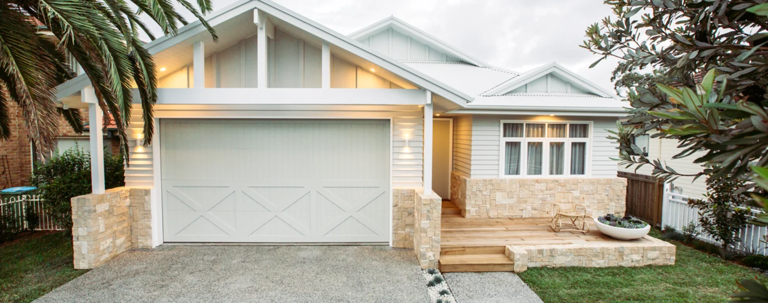
GET THE BASE RIGHT The essence of the Hamptons look – regardless of how other elements may evolve over time – remain the same. To me, the defining exterior element for an Australian-Hamptons look is weatherboard cladding. It’s all about creating long, clean lines and deep shadows. A low-maintenance and hardwearing weatherboard alternative to timber, such as Linea™ Weatherboard from the Scyon™ Walls range by James Hardie™ painted in a grey or white, is the perfect base for creating the Hamptons look.
When it comes to choosing colours for your home, always get sample pots and paint three sheets of board (around 1000 x 1000 in size) as a test. Then place them around your home – front, back and side – then go and look at them through the day: both morning and afternoon.
Other essentials include a breezy, open floor plan and a seamless transition between the inside and outside of the home. As well as nailing other fundamentals, like wooden floors – I love wide oak floorboards, in either an American mocha shade or stained dark oak – and lighting, such as a mixture of overhead pendant lighting and elegant lamps inside, and structure lights to illuminate the grooves and lines of the weatherboard outside.
COLOURS INSPIRED BY THE COAST Traditionally, a Hamptons colour scheme is comprised mostly of variations of white and neutral tones with accents of grey and blue used as complementary shades. Three Birds Renovations choose a white on white colour palette to create a clean, fresh coastal look. Mix white with natural tones from timber and jute to bring warmth to your classic coastal look. White is an essential for every Hamptons home. Here we see it used to create a resort-style feel. Three Birds Renovations choose a white on white colour palette to create a clean, fresh coastal look. Mix white with natural tones from timber and jute to bring warmth to your classic coastal look. White is an essential for every Hamptons home. Here we see it used to create a resort-style feel. Three Birds Renovations choose a white on white colour palette to create a clean, fresh coastal look. Collect images as you browseMix white with natural tones from timber and jute to bring warmth to your classic coastal look. This soothing palette of pastels, all-white or soft grey that takes inspiration from the ocean can bring an instant feeling of freshness to your home. Creating a clean and versatile backdrop for decorating, it’s a scheme that will never go out of style and is easy to work with.
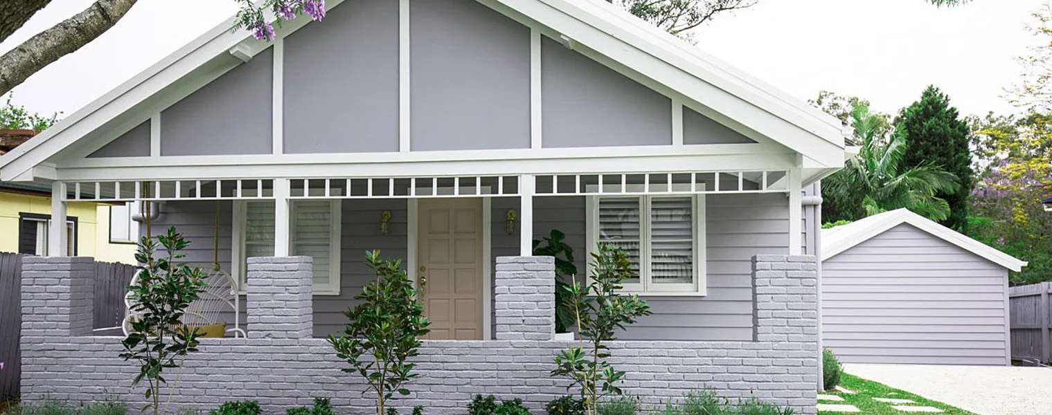
A 2019 TAKE ON HAMPTONS STYLE The top three colour trends that I see coming up in 2019 are muted blues and navy, moss greens, and darker greys – even black. Taking a considered approach to how you introduce these elegant colours into your overall palette will help you create a modern Hamptons look here in Australia.
Inside, invest in beautiful fabrics to add an accent to the muted, textured backdrop of the Hamptons look, through cushions, occasional chairs and ottomans. Muted blues and navy introduce a nautical element, while moss greens bring a touch of nature into a space. Outside, darker greys and black work as an ideal way to accentuate details and create contrast, for example, on the front door or on shutters or the mouldings of white windows.
How you introduce these colours into your Hamptons home will also depend on whether you’re striving for a modern, coastal or country take on the look.
HOW TO CHOOSE THE PERFECT COLOUR When it comes to choosing colours for your home, always get sample pots and paint three sheets of board (around 1000 x 1000 in size) as a test. Then place them around your home – front, back and side – then go and look at them through the day: both morning and afternoon.
That way, you will be able to see the light reflection and its surroundings and see if it throws any pink, blue, green or yellow. This is a sure way to fall in love with your colour selection and not make an expensive mistake. In real life, the colours you see on an Instagram, or an online picture, may not reflect the true colour. It’s always best to do this little test and see it in situ in your home and space.