Explore by category


Explore more
Explore by collection
 New
NewIntroducing our new
Hardie™ Gravis™ Panel
A lightweight concrete for external cladding, flooring and more.
Inspiration
Guides
Tools
Explore Home Styles
Modern Homes Forecast New
NewModern Homes Forecast 2026
Stay up to date with the latest trends in home designs


Natale Bowen’s Essential Rules for the Hamptons Colour Palette

Natalee Bowen
Building Designer


Colours are an essential part of creating an authentic Hamptons style home. Over the last two decades of my interior design career and through my work at Indah Island, I’ve mastered how to curate the perfect Hamptons colour palette. Read on for my tips on how to approach it.
THINK FROM THE INSIDE OUT
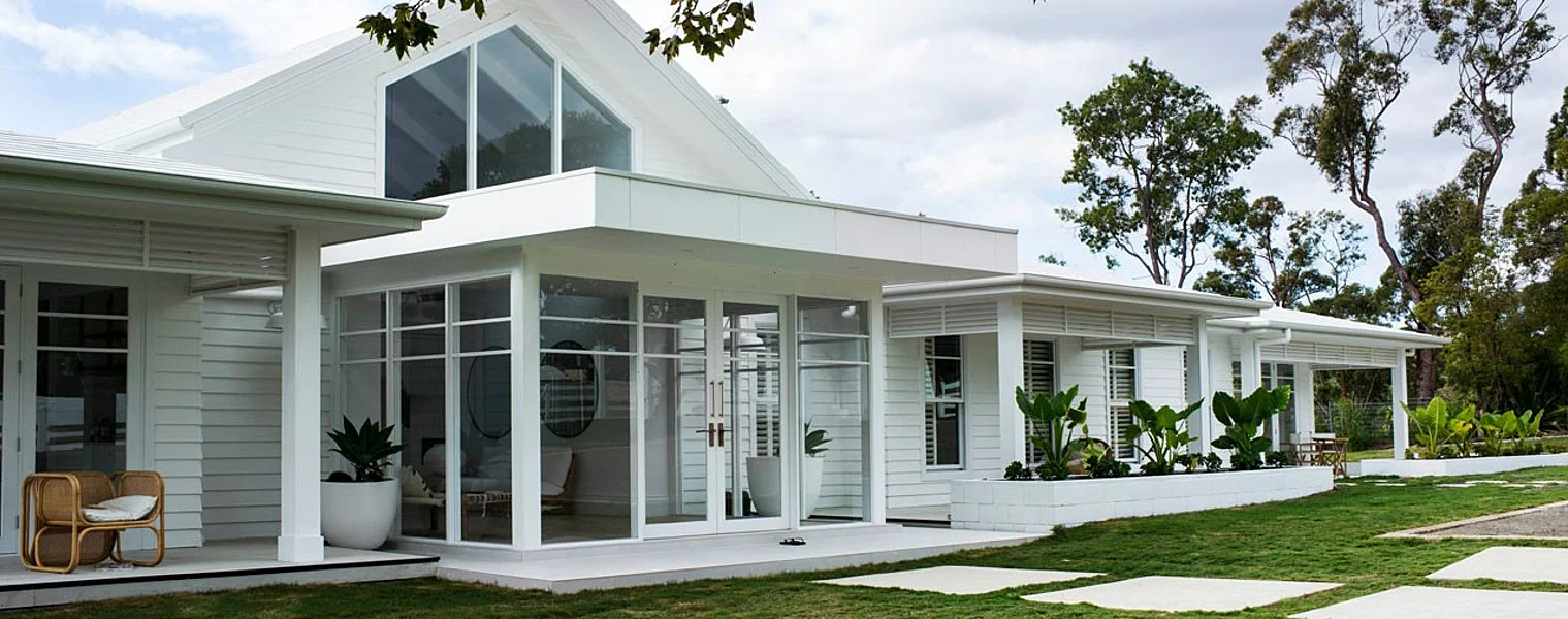
Traditionally, a Hamptons colour scheme is comprised mostly of variations of white and neutral tones with accents of grey and blue used as complementary shades.
When creating the colour palette for your Hamptons home, think about the inside first. What colourways are you going to use? That way, the flow of the home is created from the inside out. For example, if you are going to use bright modern colours, then don’t use a soft grey and white palette outside. This would lend itself to softer linens with a blue and white theme. Always think of your home holistically. If you are going for a coastal feel, then grey and whites work perfectly. If you are going for more of a traditional look, then taupe and white on the exterior lends itself to some antique furniture inside, with a more eclectic look. Finally, white on white can transition well to some tans and navy to create warmth.
USE COLOUR TO CREATE A CLASSIC HAMPTONS EXTERIOR
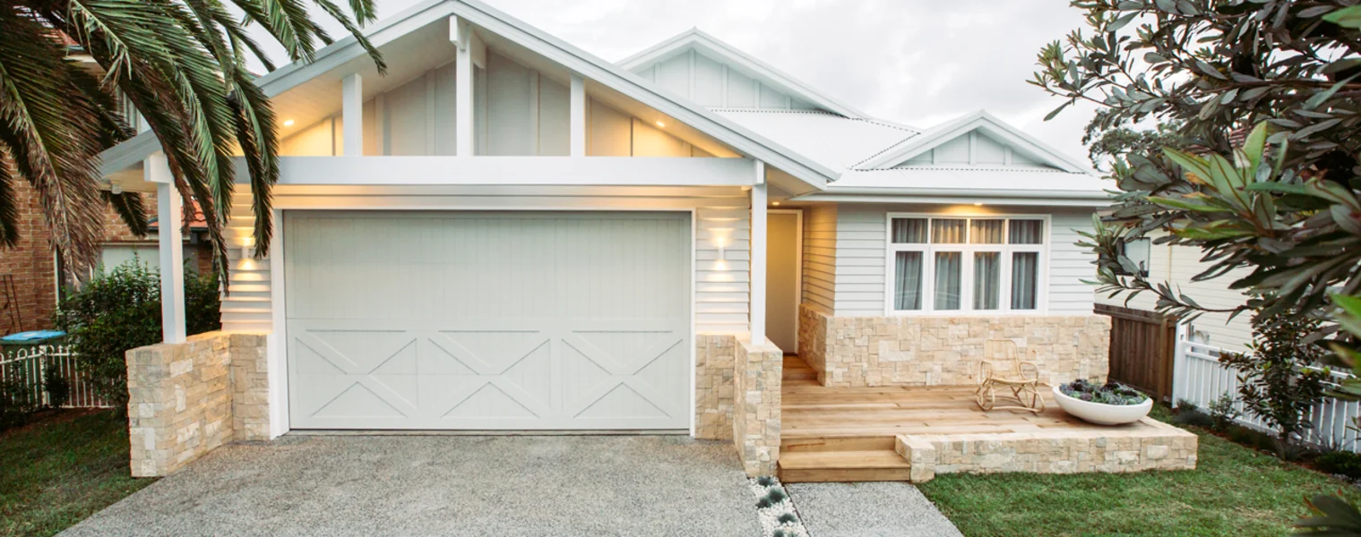
The Hamptons look, externally, is very much about the cladding. Use Linea™ Weatherboard from the Scyon Walls range by James Hardie for a low-maintenance and hardwearing weatherboard alternative to timber. Opt for a grey or white to create a beautiful coastal look. It’s a look that is never going to deteriorate and will always look classic and have longevity.
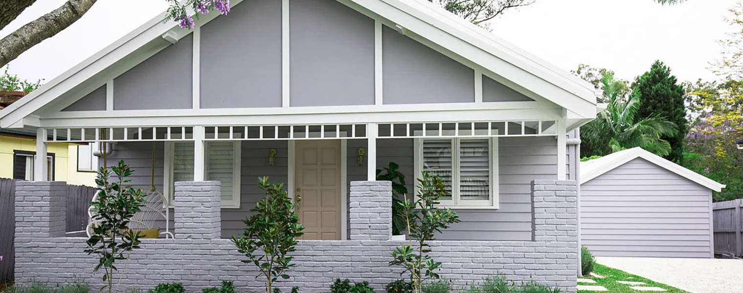
Colour is the best way to bring out detail in the exterior of a home. For example, the balustrade, the architraves and columns are all like jewellery for a Hamptons home. These are the features you want to accentuate so having them contrast and pop is a must. You often see this on a white Hamptons home with a black trim, or grey and taupes with a white trim. All the accents, such as the Axent™ Trim from the Scyon Walls range by James Hardie, act like layers to give dimension and appeal.
 Another example is roof colour. For a classic Hamptons house roof, we would normally choose a dark grey tile then pop the trims, say, a white gutter would go well with taupe, grey or white. Try to avoid bright colourways like cobalt or bright blue or browns with red tile roofs.
MAKE THE LOOK YOUR OWN
Let your personality shine through the use of colour and accessories. For example, we normally use a black gloss for the front door. However, we are now seeing more Hamptons homes using colours like navy, pale blue, pink and teals on their doors. Your door hardware can also be a signature piece. A great knocker or pull handle and a bell are also great accessories, which allow you to have some fun and make it your own.
TOP TIPS FOR CREATING THE PERFECT HAMPTONS COLOUR PALETTE
-
When creating the colour palette for the home, think about the inside first. What colourways are you going to use? That way, the flow of the home is created from the inside out.
-
For a Hamptons-style exterior, use Linea™ Weatherboard from the exterior cladding range by James Hardie in a grey or white to create a beautiful coastal look.
-
Colour is the best way to bring out detail in the exterior of a home. For example, the balustrade, the architraves and columns are all like jewellery for a Hamptons home, so accentuating them is a must.
-
Have some fun and let your personality shine through in your home by introducing elements, such as pops of colour or fun door accessories, like pull handles or bells.